No Japanese-specific structure
General flashcard apps don't natively hold kanji, yomigana, and meaning as one unit, so every entry becomes a workaround.
 Google Youth Advisor
Product & Graphics, senior at CalArts.
Born in NewJersey, raised in Seoul and Frankfurt.
Always curious about the world and ready to explore!
An iPad-first Japanese vocabulary app that puts handwriting, self-made study sets, and a brick-stacking game in one place. Built end to end — designed in Figma, then prototyped in SwiftUI so the interactions could be tested by hand rather than described.
I'm a self-taught Japanese learner, studying for the JLPT and trying to hold real conversations. I don't work through a single textbook. Words arrive from everywhere — a drama subtitle, a conversation class, a menu — and I want to capture them the moment I meet them.
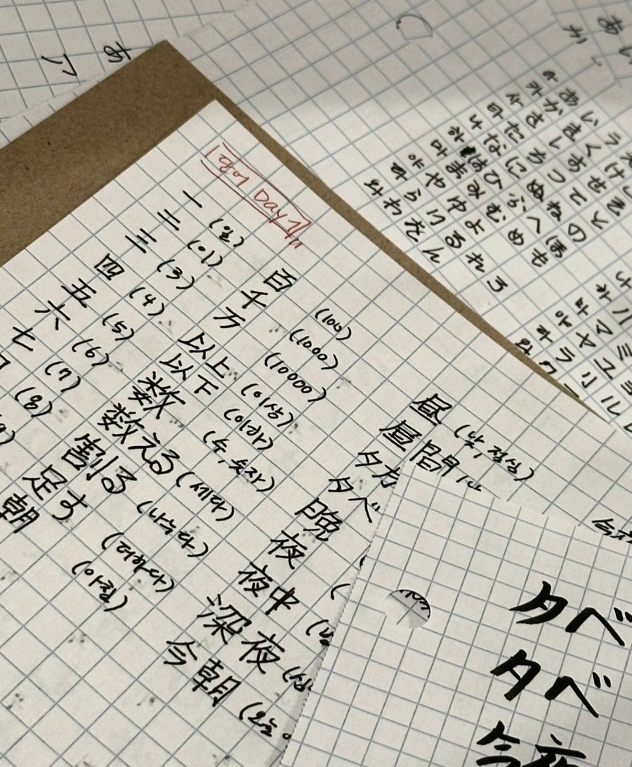
The way I actually memorize is old-fashioned. I write a word out by hand, over and over, until it sticks. It works, and it builds familiarity with all three writing systems at once. It also burns through notebooks, and once a page is full, that vocabulary is effectively gone — there's no way to search it, track it, or bring it back.
Every tool I tried solved one part of this. Dedicated JLPT apps have the right curriculum but won't let me add today's word. Quizlet lets me build my own sets but has no concept of the kanji + yomigana + meaning structure Japanese needs. The notebook memorizes best and remembers least. No single tool supported the way I actually learn.
How might I design a Japanese vocabulary app that supports the way I actually study — writing by hand, adding words as I meet them, and revisiting what I've already learned?
This was a solo project built from my own study habits, so the research is narrow by design: an honest audit of the three tools I was already using, and what each one couldn't do.
I've been learning Japanese to prepare for the JLPT and improve conversationally. Rather than following one curriculum, I collect vocabulary from wherever I encounter it. My preferred way to memorize is writing words repeatedly in a notebook — it sticks better and it makes the three scripts feel less foreign. The cost is that I go through paper fast, and there's no way to track or revisit what I've already written.
 회독 JLPT dedicated
 Quizlet general
General flashcard apps don't natively hold kanji, yomigana, and meaning as one unit, so every entry becomes a workaround.
Writing by hand is what makes a word stick for me, and no app supports it — which forces a parallel paper notebook alongside the app.
Existing apps are passive. Read a card, flip it, move on. Nothing holds attention long enough for a habit to form.
Every session is an island. Nothing resurfaces the words I learned last week in a way that builds on itself.
An app where I can add words as I meet them, memorize them by writing them out, and revisit everything through play.
The design system came first, then four core experiences — each one mapped to one of the problems above.
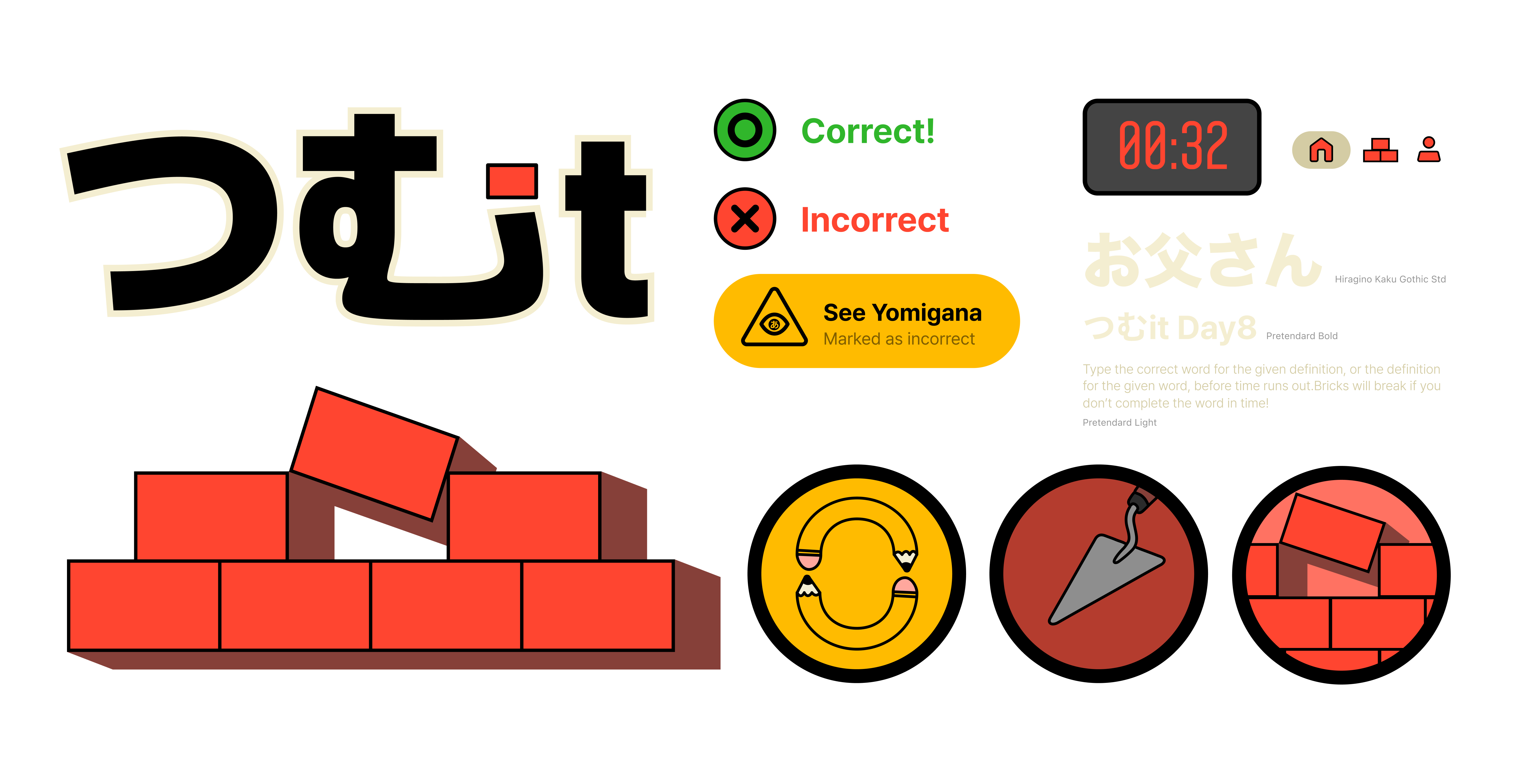
Pretendard Variable runs across the whole interface. The palette is a warm ivory ground with punchy accents, and every component shares a 15px radius and a heavy black border. The signature motif is the brick: 3D-extruded, stackable, and the visual anchor for the app's name — つむ, to stack.
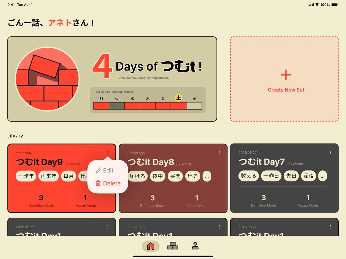
The dashboard opens on a streak counter and the week's progress, then a grid of every set I've built. Cards shift color by how long it's been since I studied them — red for yesterday, deep red at two to five days, grey once a set has been sitting for a week.
Neglect is visible at a glance, which turns the library itself into the reminder.
Yesterday's set glows red, three days ago has gone deep red, and anything older sits grey.
Sets are defined by the user, not the curriculum. Each row captures the Japanese word, its yomigana, and its meaning as a single unit, so the structure Japanese actually needs is built into the data instead of improvised per card.
Solves problem 01 — no Japanese-specific structure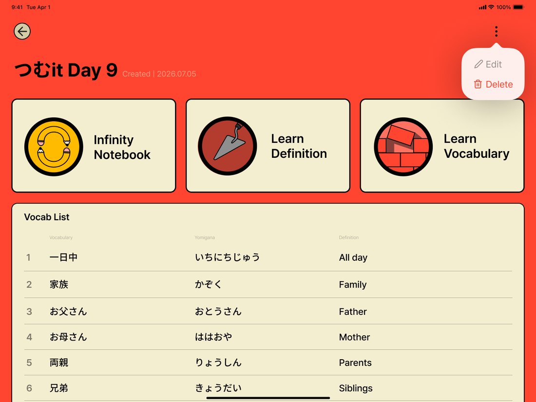
Set detail. Three modes across the top, and every row holding word, yomigana, and definition together.
The paper notebook, minus the paper. Write the word out with an Apple Pencil or a fingertip, as many times as you want, on a surface that never runs out. A faint watermark of the target word sits underneath for tracing, and the word and yomigana columns each have their own visibility toggle, so the support can be removed one layer at a time.
Solves problem 02 — no digital handwritingThe notebook that never runs out — trace the watermark, then hide it one column at a time.
See the Japanese word, type the Korean meaning. A yomigana hint is always available, but pressing it marks the answer wrong — the score stays honest, and the hint stops being a free pass. A segmented progress bar keeps the session finite so it ends somewhere.
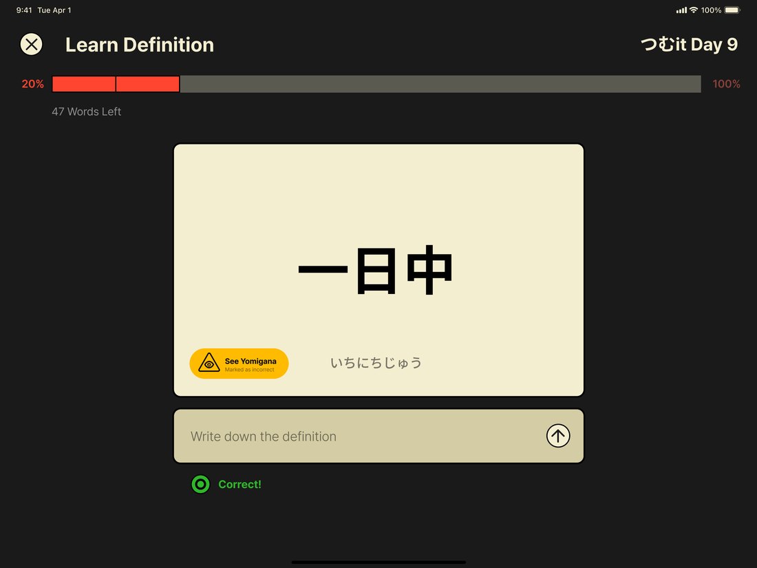
The yellow hint button spells out the reading — and marks the answer wrong for taking it.
The same test in reverse: read the meaning, produce the Japanese. Typing and handwriting sit behind one toggle with a spring transition between them. In handwriting mode the Vision framework reads what I actually wrote and grades it, which means the input is the practice rather than a shortcut around it.
Handwriting mode. The toggle at the right swaps to typing; Vision reads and grades what's written.
The cumulative-learning problem, turned into a game. Bricks fall from the top carrying a meaning; I have fifteen seconds to type the matching Japanese word before the brick shatters. Right answers snap into the wall and it grows. Miss too many and the wall crumbles.
Crucially it pulls from every set I've ever made, so words from three weeks ago keep arriving without me choosing to review them.
Solves problems 03 and 04 — interactivity and cumulative learningA brick falls with a meaning; type the word before it shatters, and it snaps into the wall.
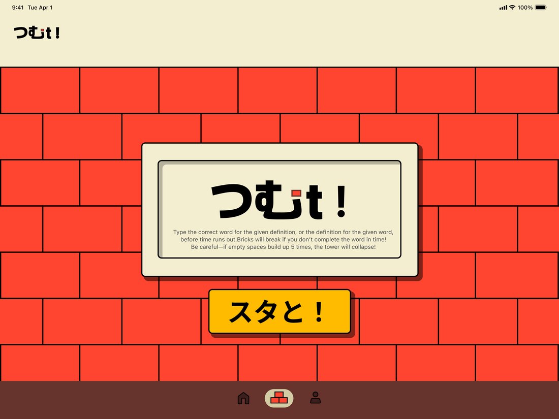
Intro — the rules, then スタと! to drop the first brick.
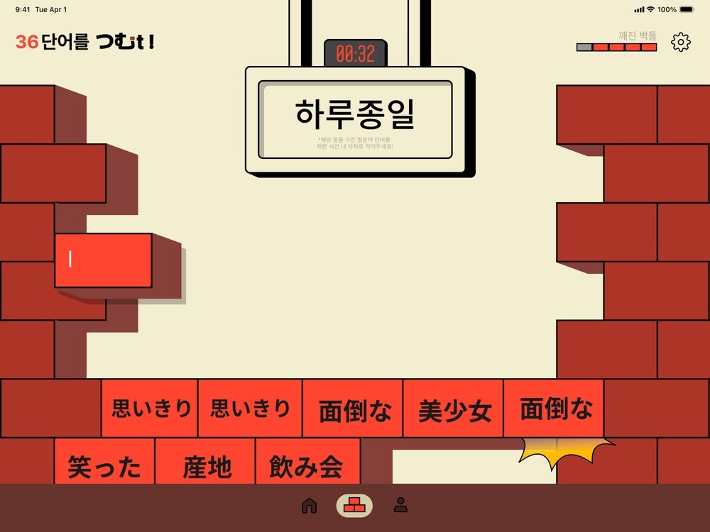
Mid-game. The timer runs at the top, answered words stack into the wall below.
The most useful thing about this project wasn't the design work. It was everything that only showed up once the design had to run.
Building in SwiftUI rather than stopping at Figma surfaced problems no static mockup would have revealed. A brick that looked crisp in Figma rendered as a flat drop shadow until I rebuilt it as a real 3D-extruded polygon. A text input that worked fine on macOS silently failed on iPad, because the falling brick's position changed every 0.05 seconds and kept breaking the focus state. Those are decisions a designer only meets inside a real runtime.
I used Claude as a coding partner throughout, which let me test more than ten visual and interaction iterations in the time one high-fidelity mockup usually takes. It changed how I designed. Instead of polishing screens upfront, I made them deliberately rough, ran them, and refined based on what broke or felt wrong in the hand.
Vision kept marking correct handwriting as wrong. The fix wasn't code — it was a design problem wearing a bug's clothing. I hadn't accounted for how much space people leave between characters when they write, so Vision was splitting one word into several lines and inserting whitespace. Building a debug overlay to see what Vision actually read let me find the real cause and widen the tolerance to match how people write.
There were no interviews and no personas here — the whole thing came from my own study habits. That made sharp, opinionated calls easy to defend: fifteen seconds per brick because fifteen seconds is how long I need to think under pressure. The trade-off is real, though. The next step has to be putting it in front of other learners to find out which of my preferences generalize and which are just mine.